Curbside Pickup Order Tracker
Streamlining the Waiting Experience for Busy Shoppers

Overview
TwinMart is a grocery chain that wants to improve the curbside pick experience for its customers and better reflect the company’s speed and convenience it’s known for in the market.
Deliverables:
Wireframes
Low Fidelity Design
High Fidelity Design
Protoype
My Role:
Discovery Research
Lead Designer
Methods & Tools:
Directed storytelling
Usability testing
Think-aloud evaluations
Affinity diagramming
Figma
Zoom
The Problem
The curbside pickup service, although convenient, left users feeling anxious and uncertain due to a lack of real-time updates and clear information about their orders. My goal was to create an intuitive order status tracker that provides timely updates and reduces user anxiety during the waiting period.
The Research
Pinpointing the users' main concerns:
I conducted a series of 3 user interviews using the directed storytelling method to gather insights into their experiences with curbside pickup.
🎯 My goal was to understand whether these users were satisfied with the service and what their overall experiences were.
💡 During the interviews, I discovered a significant need for more real-time status updates and progress information while waiting for their orders. Additionally, users expressed frustration with the lack of communication during the pickup process.
🛠️ Armed with this knowledge, I began planning improvements to the curbside pickup experience based on the users' concerns. My primary focus became enhancing the order tracking and communication features to ensure a smoother and more reassuring experience for the customers.

User pain points
Design
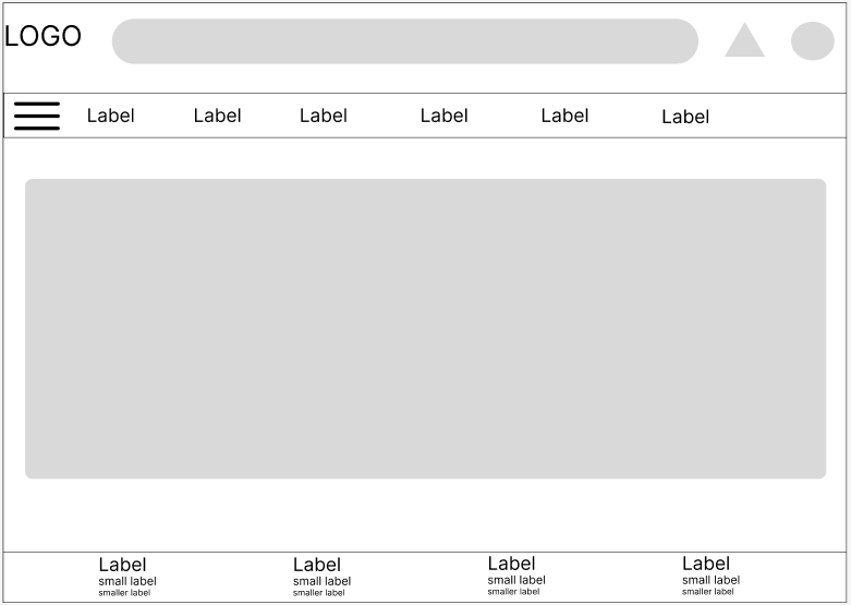
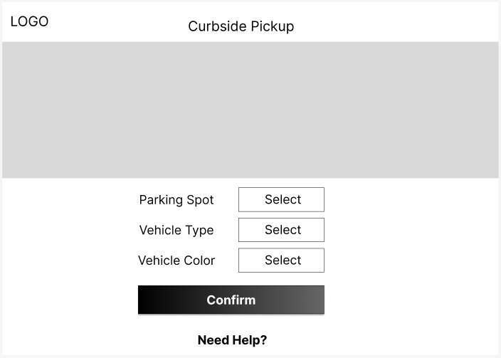
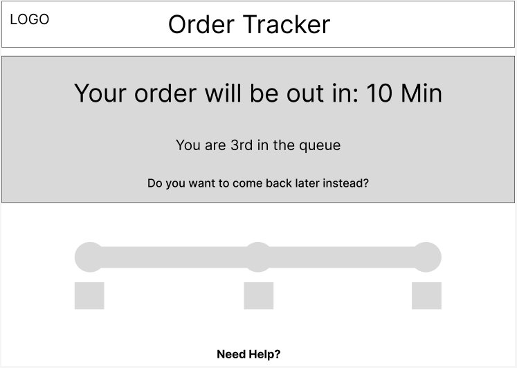
Low Fidelity Wireframes
In the low fidelity wireframe section, I created preliminary sketches and basic layouts of the 3 main pages to visualize the new features and improvements, focusing on enhancing real-time order status updates.
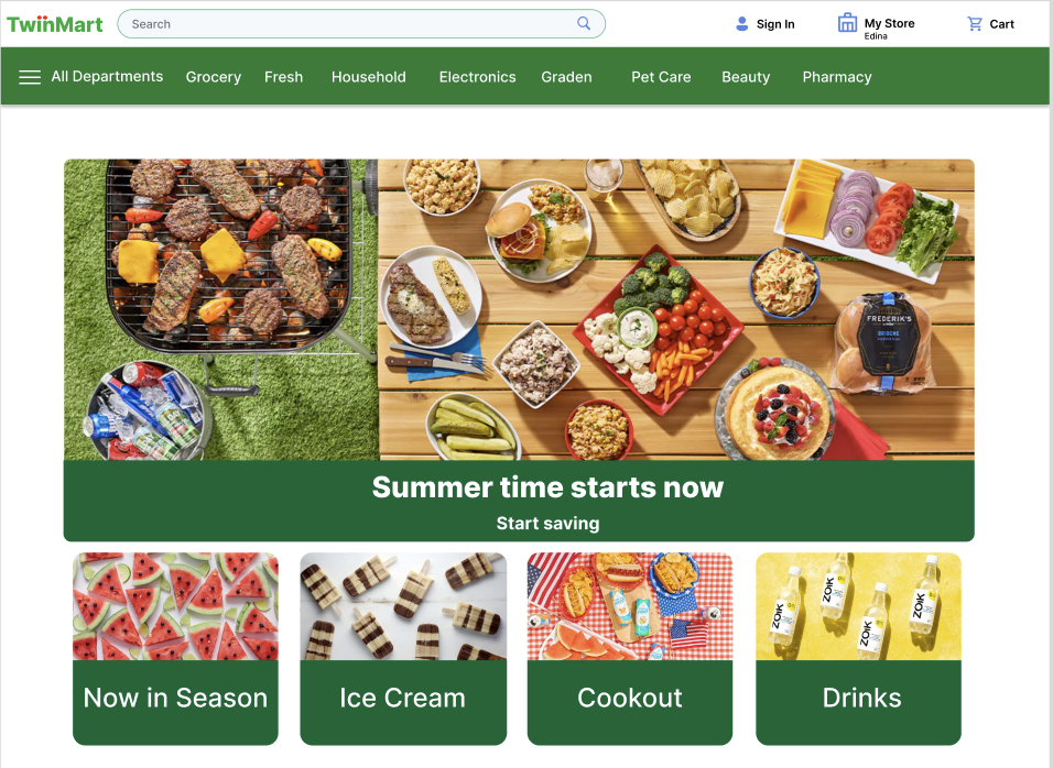
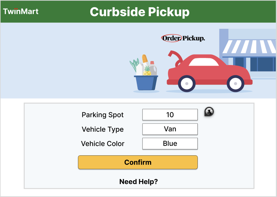
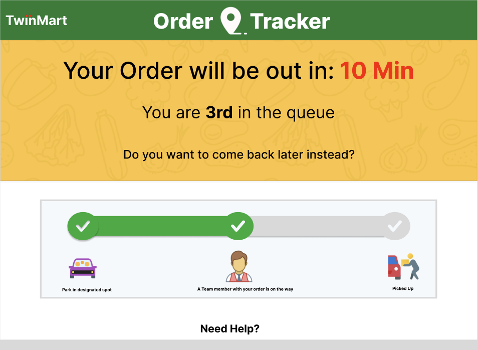
High Fidelity Wireframe
In the high fidelity wireframe section, I translated my preliminary sketches into detailed, interactive prototypes. These wireframes incorporated specific design elements, color schemes, and typography to closely mimic the final user interface.
My key focus areas were:
Real-time order tracker
Clear & simple UI
Intuitive
These high fidelity wireframes were crucial for gathering detailed feedback and making adjustments.
Testing
Objective: Would our curbside pickup improvements actually enhance the user experience?
Method: To test the effectiveness of our design in meeting users' objectives, I conducted think-aloud evaluations with three individuals over Zoom. This approach allowed me to understand users' thought processes as they navigated the site, identifying what they were looking for and which design aspects were barriers. Additionally, I aimed to gauge their feelings and frustrations to ensure the site provided a positive experience.
Procedure: Participants were asked to narrate their process as they navigated the prototype website to:
Check the status of their curbside pickup order.
Experience the new streamlined check-in process.
Provide feedback on the overall user experience.
Evaluation Goals:
Alignment with User Goals: Assess how well the website supports users in checking order status.
Identify Pain points: Identify any points of confusion or obstacles users encounter while navigating the website.
Gauge User Satisfaction: Evaluate the website's effectiveness in creating a reassuring and positive shopping experience for users.
Findings
3 out of 3 Users appreciated knowing the current status of their order
3 out of 3 considered the progress bar to be very helpful in understanding how close their order was to being ready.
3 out of 3 generally found this page to be clear and easy to understand.
3 out of 3 Users felt the order status tracker provided the necessary information they needed.
2 out of 3 appreciated the "come back later instead" option.
“I feel more calm and not restless because I know exactly how long it will take for my order to arrive.”
Recommendations
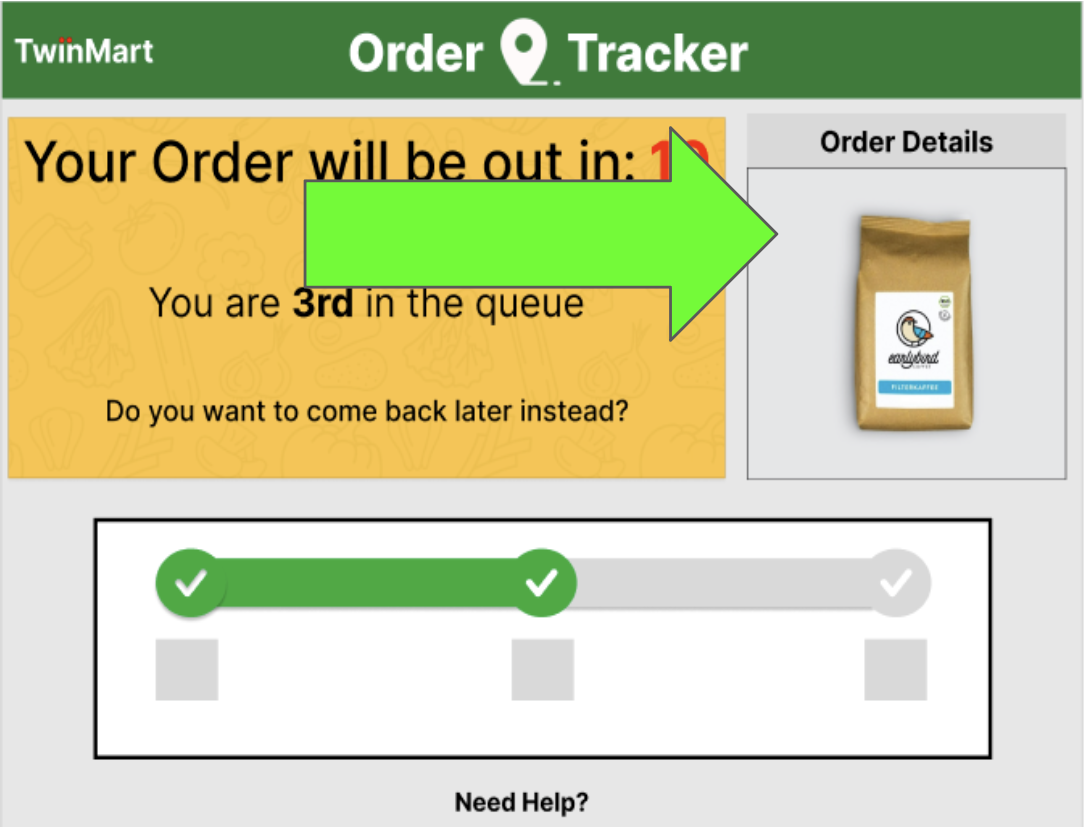
Order Details:
Based on user feedback, one key recommendation is to enhance the order status tracker page by including a summary of the items being waited for. Users expressed a strong desire for more detailed order information, which would provide greater clarity and reassurance during the waiting period. Implementing this feature would improve transparency and help users feel more informed about their curbside pickup orders.
Lessons learned
Throughout this project, I learned the critical importance of real-time communication in enhancing user satisfaction.
Users highly value transparency and detailed information, particularly regarding their order status.
Additionally, the think-aloud evaluations highlighted the necessity of addressing user pain points to streamline the pickup process.
These insights will be invaluable for future improvements, ensuring we continue to meet and exceed user expectations.